Tech-Talk: Surface Magic
Welcome to my tech talk about surface magic - Why its sometimes cool and why you shouldn't use it. (Maybe, I don't know, I'm not your boss.)
But first, a little background. This game has been a learning process, and now that I'm nearing the end of it, I'm a little older and wiser. I've seen a few gifs here and there with similar designs/mechanics to Zofia's surface magic, but I haven't seen much talk on it.
So this tech talk is how we came up with this design, what drawbacks we ran into, and what I would probably do to fix it in the future.
Back to the point, what is surface magic? In short, if you use a button and you're looking at a surface, you'll alter it (or yourself) with magic in some way.
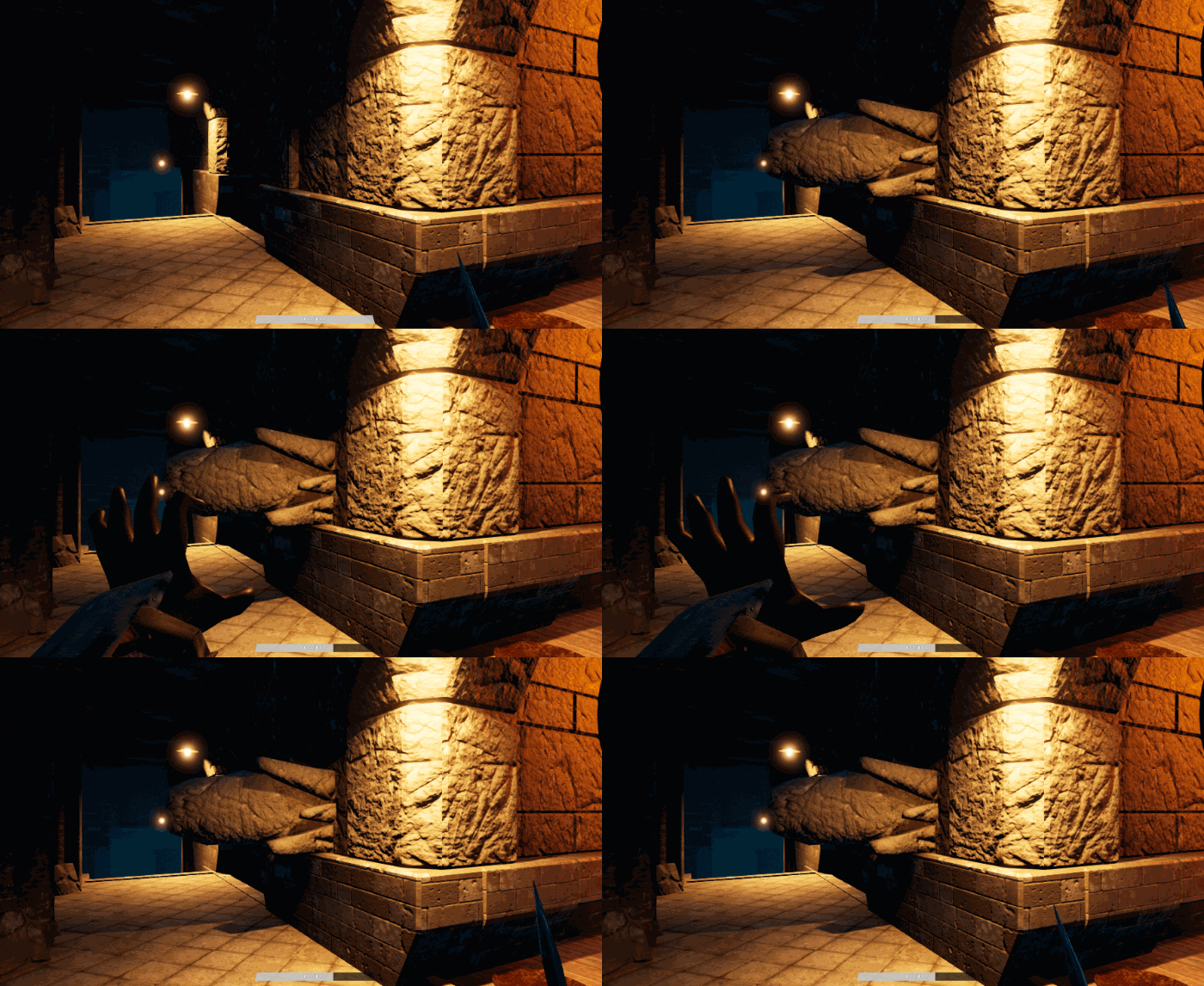
I made this decision early on, not just because of Avatar, but because it turns the environment into a tool and mechanic. We wanted magic to interact with the world but every solution we came up with was so very heavy on the UI. It certainly didn't feel like "magic" to pop open a menu, assign 'boulder strike' to your equipment slots, then throw a rock at someone.
It was important to make magic both a utility and a weapon. Once a player starts to grasp the mechanics, they could hopefully come up with creative solutions to dispatch enemies or navigate the environment.
This system has had a myriad of both benefits and problems. First, some drawbacks.
Drawback 1: How this ended up impacting the art.
The surface is based off of the Physical Material (which in Unreal, is usually used for sound or effects), because of this, more complicated assets need to have separated materials. On small assets it doesn't really matter - I don't think anyone is going to aim for pixel precision to use magic on a leather knife handle. But on big assets you end up with 'very obviously different material chunks' on assets.
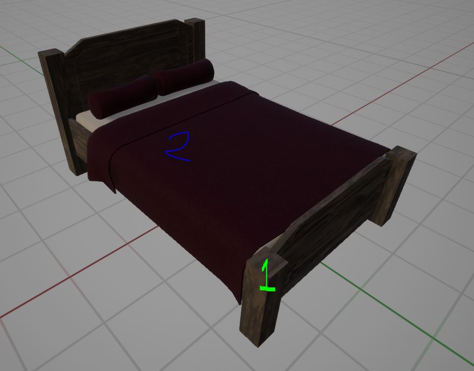
If you're an artist, you might be rolling your eyes right now. (Or if you're not, you can roll them anyways. You do you.)
Now, we didn't overhaul the art style to accommodate this - This was already in partial alignment with what we had going on. However, this did put some strain on some assets as the separate material design increased the amount of materials on a single asset from ~1-5x.
If I had to do this over again, I probably would have done a different art style that accommodates this mechanic, as the mostly realistic-ish starts to look a little off in some circumstances.
Drawback 2: What about surface XYZ?
Another quirk we ran into is, what if you use magic on stone? That seems simple enough. Wood? Also easy. A light bulb? What about an enemy? Hmm... What about this espresso machine?
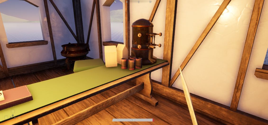
Do we generously hand over the limitless potential of coffee magic? Well unfortunately we had to start drawing a line somewhere. I feel I could have gone way, way further with additional surfaces and interacting with magic, but it started becoming a bit too much too quick.
A big part of this was enemy design. I'm not some fancy pants AI designer (I'm barely an indie dev) so I ran into a lot of circumstances where it was difficult to get an enemy to respond to the situation as I wanted them to, let alone when various magic(s) were influencing them or the player.
The other piece of this was - is this even useful mechanically? Using ash/dust magic would originally allow you to glide, but given the other movement mechanics in the game, this was rarely a very useful function and so never got used.
Drawback 3: Balancing
The whole mechanic created an unusual rift in terms of balancing. The game is very possible to beat using mostly hack and slash, parrying and kicking, but there are many circumstances where magic gives you such an outright advantage that is creates a problem. Why bother with a sword fight if you can just launch an enemy off a bridge?
Why use a ranged weapon when you can chunk a rock with a melee weapon just fine?
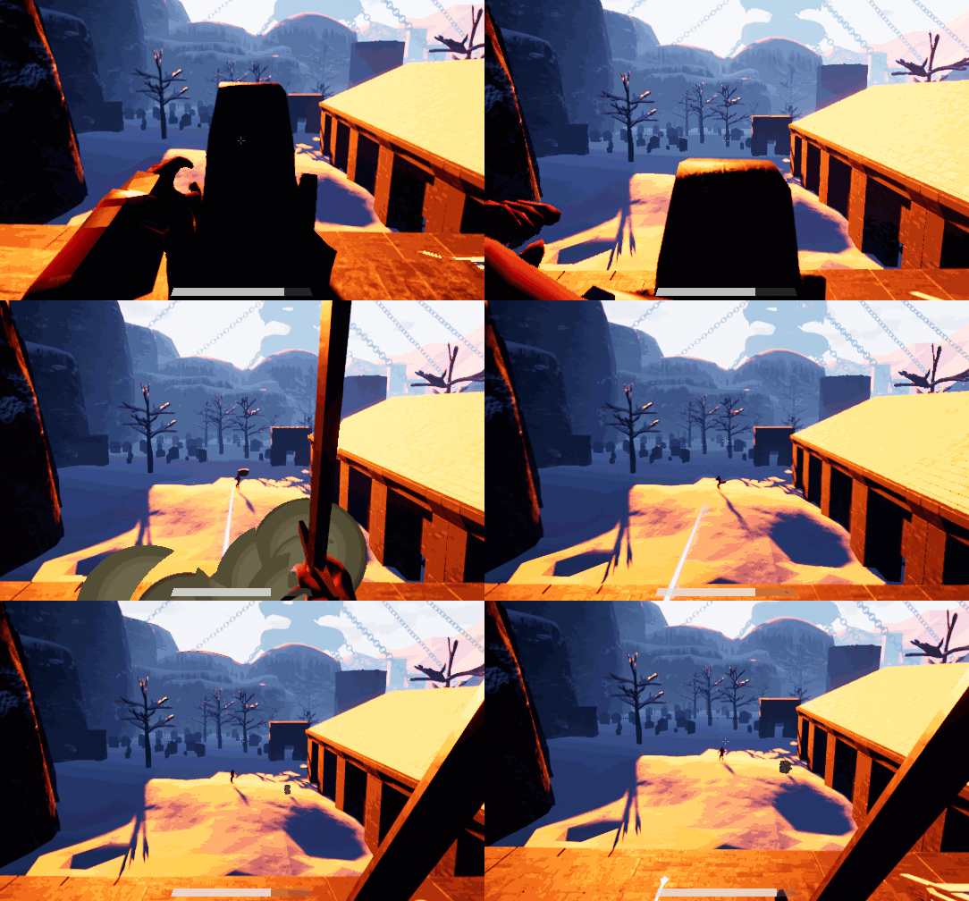
Another slight quirk to this, is that you can easily assign/show damage numbers for a weapon. While you could show damage numbers on hit (Which can bring its own unique issues), I can't think of any reasonable way to have a decent UI show the damage output of some of the combinations of these abilities.
The strength of the magic led to the creation of specific enemies who are resistant to certain magic tactics, with some being outright immune to certain elements. I don't think I nailed this one but, it was an attempt.
This influenced level design a decent amount because element available changed the balance of an arena. You generally want the player to have more options, but setting it up too much might make it too easy. I don't think I necessarily nailed this one though - We were far too reliant on large stone structures for much of the architecture which leads to some samey tactics.
What I would have changed:
Honestly I probably would have leaned more into weird elements. I think its actually very fun to find an unusual element and see what you can do with it, and try to experiment with it for combat or for a puzzle.
There was a lot of Avatar inspiration discussion about having the player select a specific 'school' of magic and have all their abilities revolve around that. I think there is a lot of potential in that idea, but I'd also imagine that would be difficult to balance from a level design standpoint.
Lastly I think it could have been really neat to lean into different magic abilities depending on what else you're doing. For example, blocking and using magic on the floor below you could create a temporary wall around you, or maybe have a way to reinforce your weapon with an element, such as fire. This could also become very technical so its a bit iffy.
Anyways thanks for coming to my tech talk.
Get Zofia
Zofia
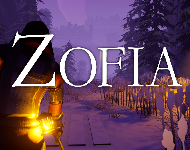
Zofia is a first person RPG. Make a custom character, utilize surface-based magic, grapplehooks, and lots of weapons.
| Status | Released |
| Author | justdaveisfine |
| Genre | Adventure, Role Playing |
| Tags | Co-op, Fantasy, First-Person, Local multiplayer, Sci-fi, Split Screen, Unreal Engine |
| Languages | English |
More posts
- Zofia - Final (?) Demo UpdateMar 05, 2024
- Zofia Devlog #15 - Random ThoughtsFeb 17, 2024
- Dev/Rant Blog #1: Sailing strugglesNov 05, 2023
- Update HotfixesJul 03, 2023
- Update!Jan 18, 2023
- Heck Yeah - It's playable!Apr 27, 2022
Leave a comment
Log in with itch.io to leave a comment.